TELUS App Icon Ecosystem
Evolving TELUS’ mobile app icons into a scalable visual system for a growing digital product ecosystem.
Role
Digital Designer, Platform Adaptation
Scope
Visual systems
Brand identity
Icon exploration
Platform adaptation
Dark mode testing
Design QA
Production handoff
Organization
TELUS Brand
Year
2026
The Challenge
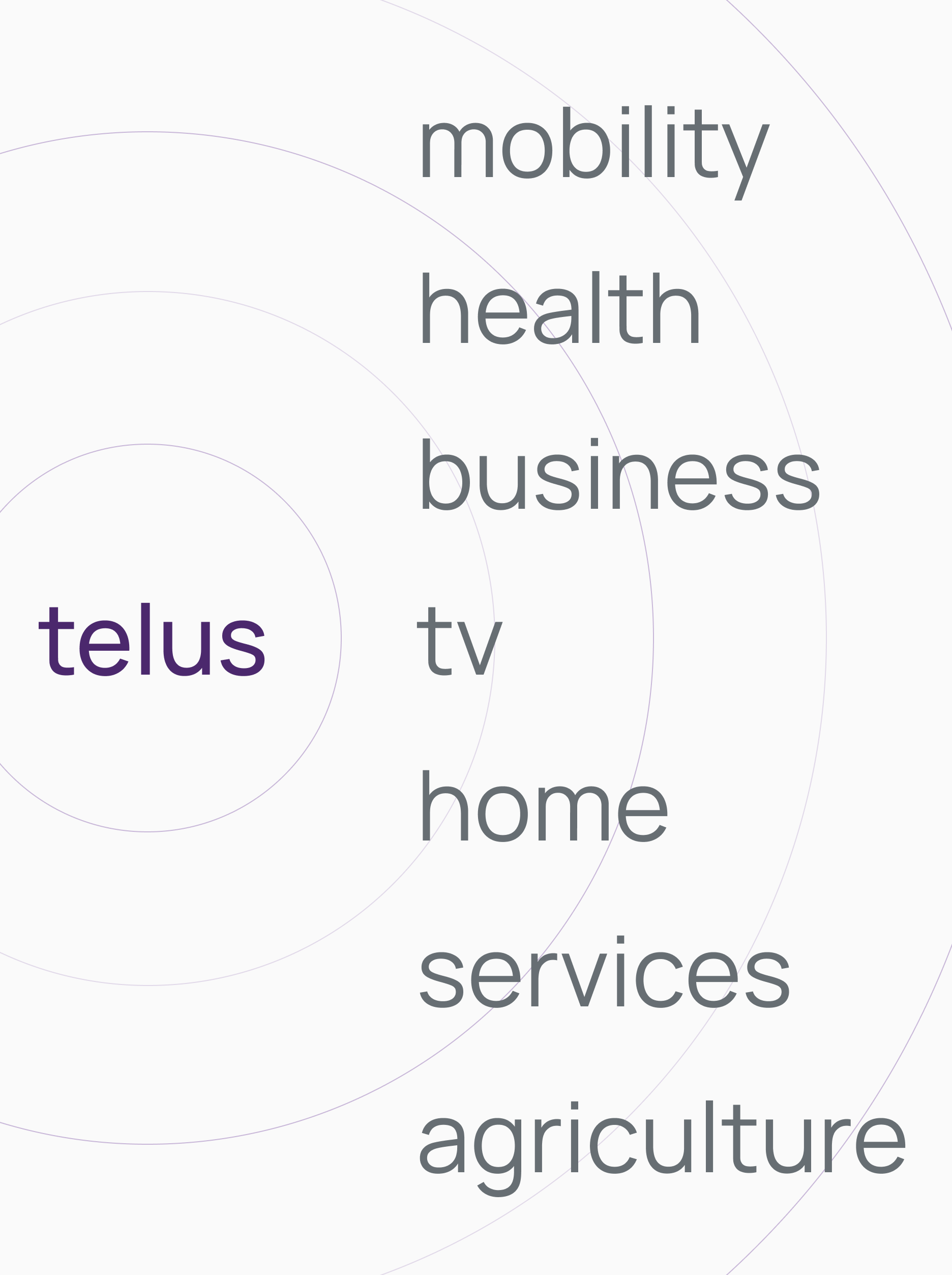
TELUS had outgrown its original mobile app icon strategy. As the app portfolio expanded across consumer, business, health, agriculture, smart home and security products, the system needed to become more flexible while still maintaining a clear connection to the TELUS brand.
Contribution
I translated the refreshed visual direction into platform-ready icon variations, supporting regular, dark mode and glass mode explorations while pressure-testing the system for clarity, consistency and scalability.
Visual Systems
|
Visual Design
|
Brand
|
Icon explorations
|
Visual Systems | Visual Design | Brand | Icon explorations |
Outgrowing a uniform system
The existing uniform icon approach created consistency, but limited the system’s ability to express product diversity and contextual relevance. As the portfolio grew, the icon direction needed more range while still feeling unmistakably TELUS.
-
![]()
Uniform, but limited
A single visual treatment helped create consistency, but made it harder for products to express their unique purpose and context.
-
![]()
Harder to scale
What worked for a smaller set of apps became harder to differentiate as the portfolio expanded across multiple lines of business.
-
![]()
Products needed more distinction
As apps grew across consumer, business, health, agriculture, smart home and security, each product needed a clearer sense of identity while still feeling part of TELUS.
-
![]()
Platform expectations changed
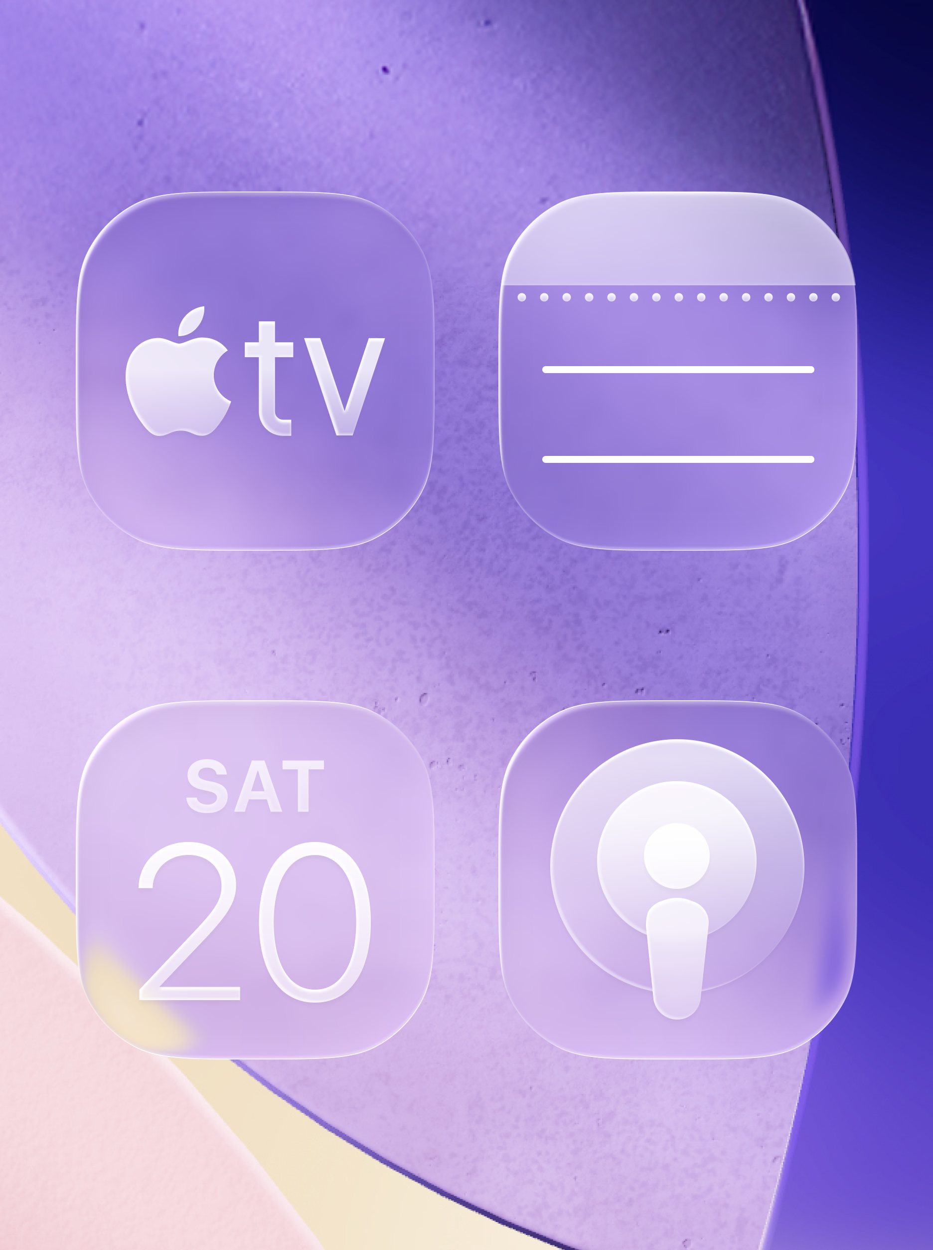
New OS experiences introduced additional requirements, with icons needing to perform across light mode, dark mode and glass mode.
Building distinction into the system
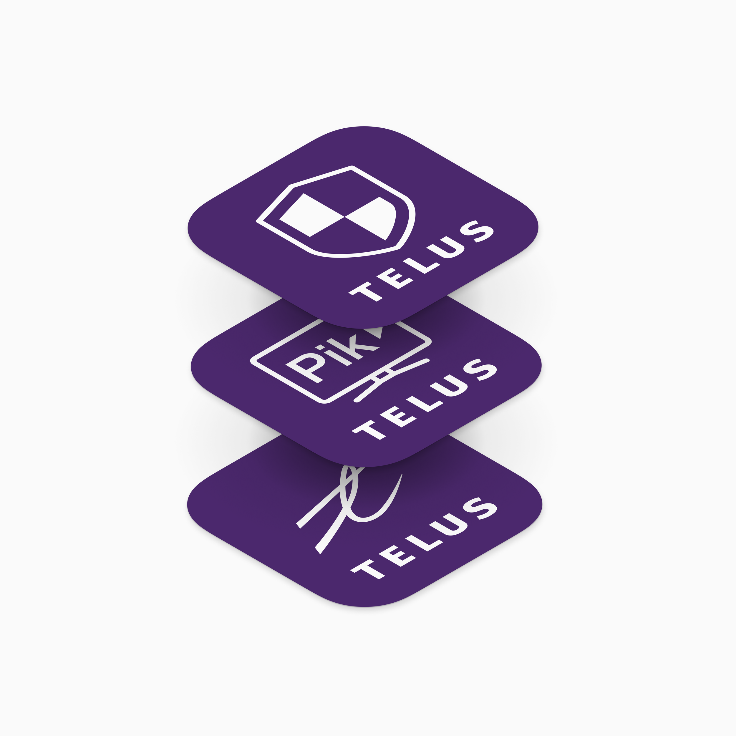
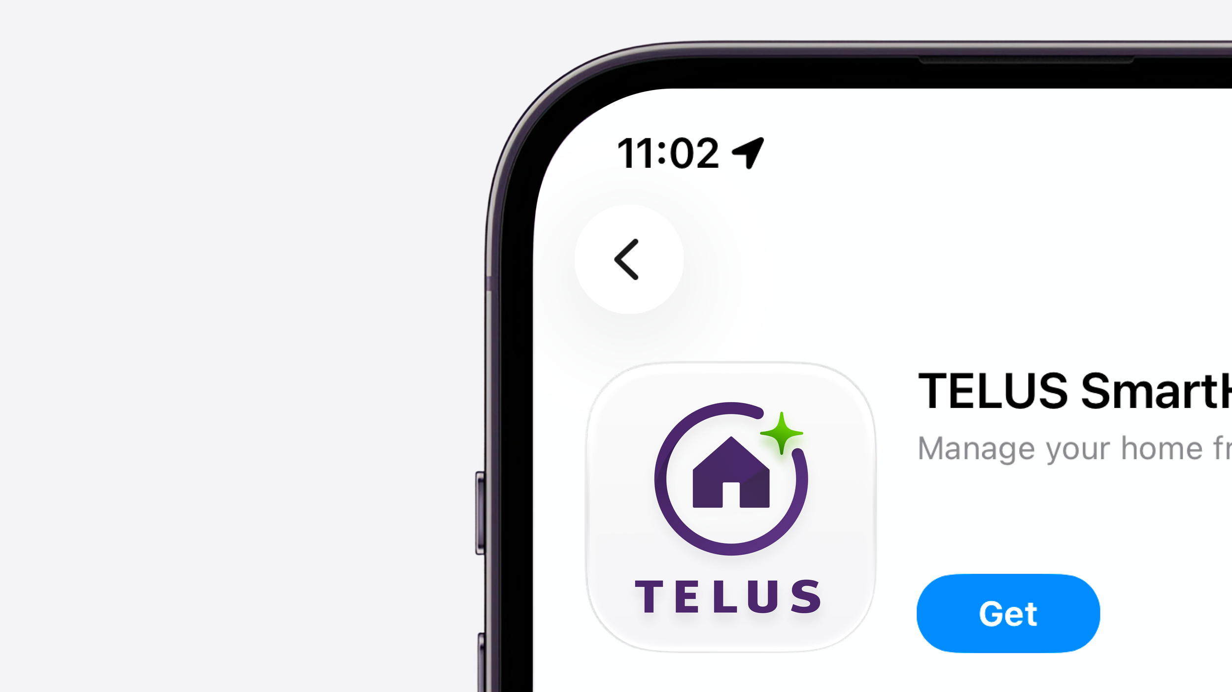
The opportunity was to create a system that could flex across products without becoming fragmented. By separating fixed brand elements from flexible product cues, each icon could carry its own meaning while still belonging to the TELUS ecosystem.
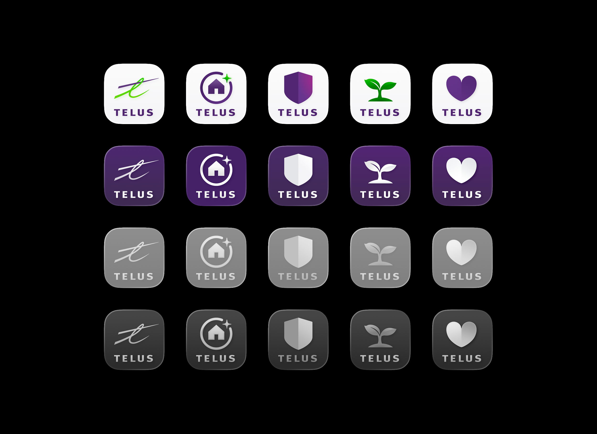
Each icon uses a shared TELUS foundation, while product-specific cues help communicate what the app does and where it belongs in the broader ecosystem.

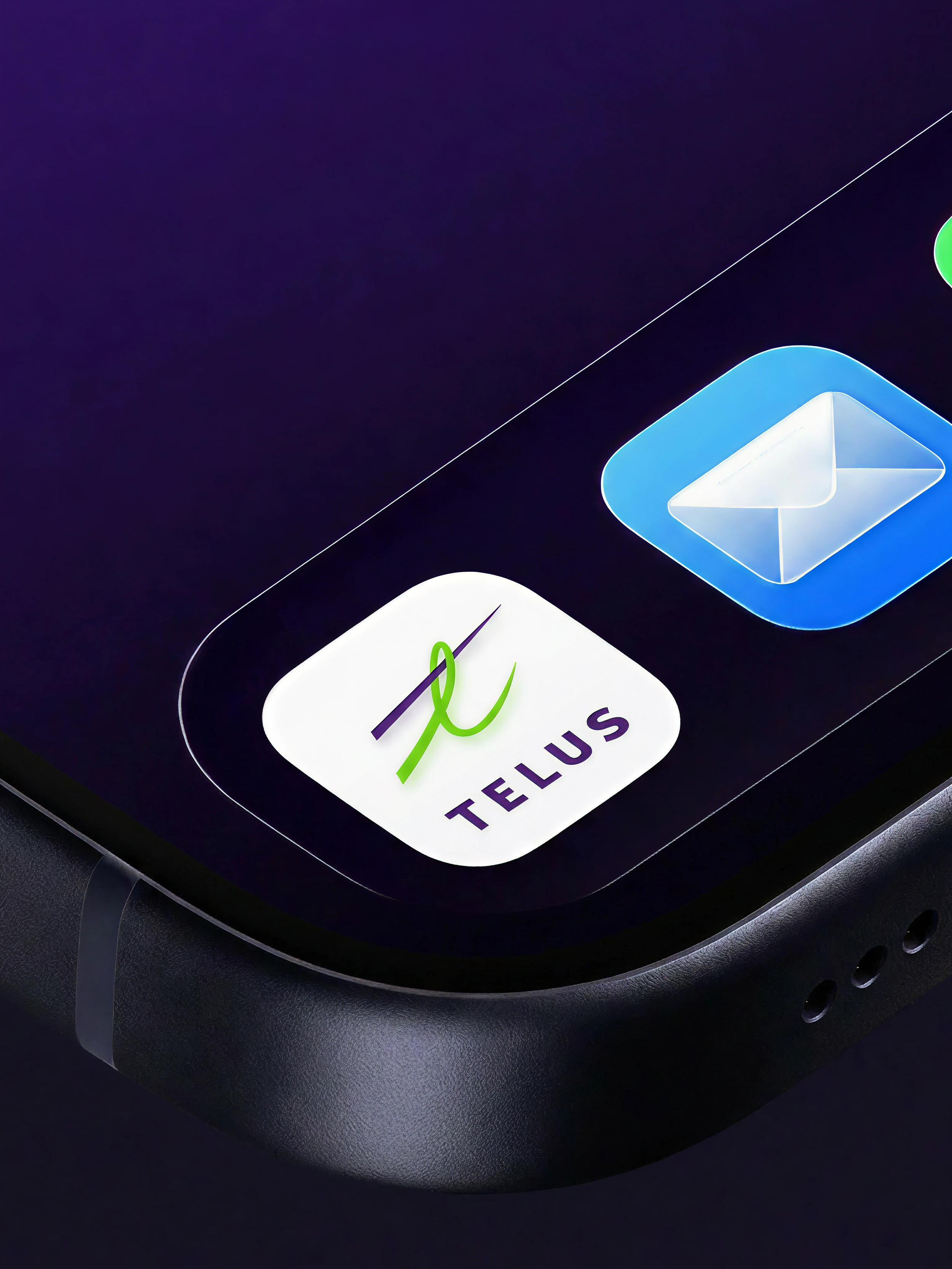
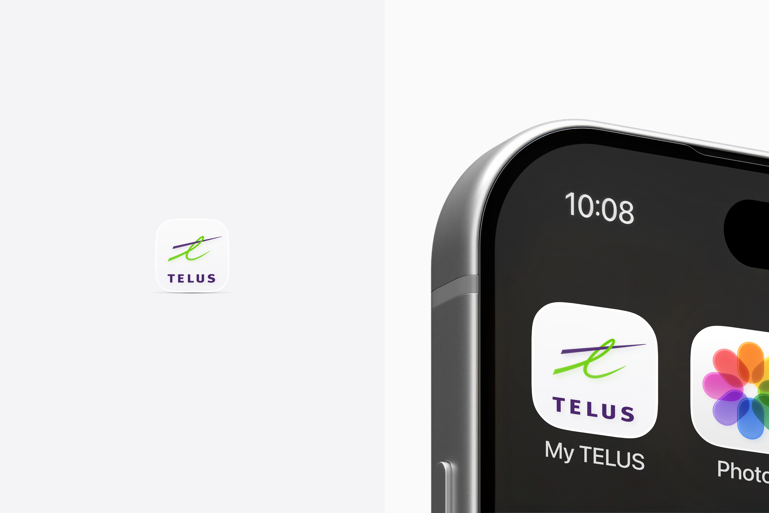
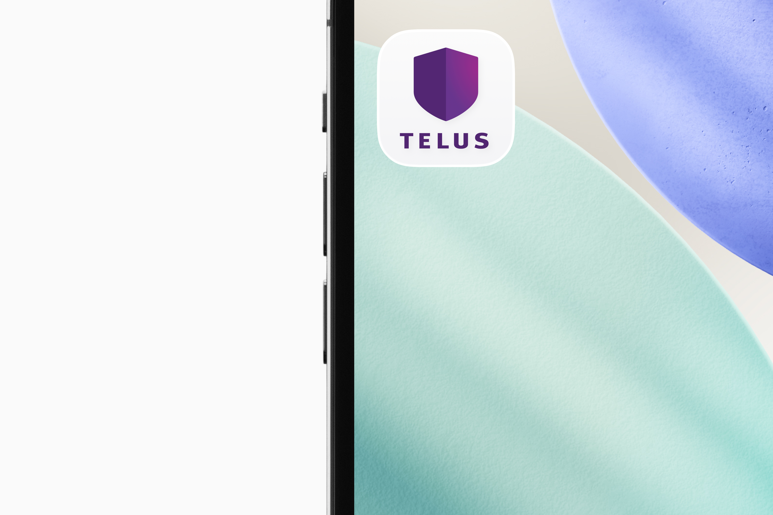
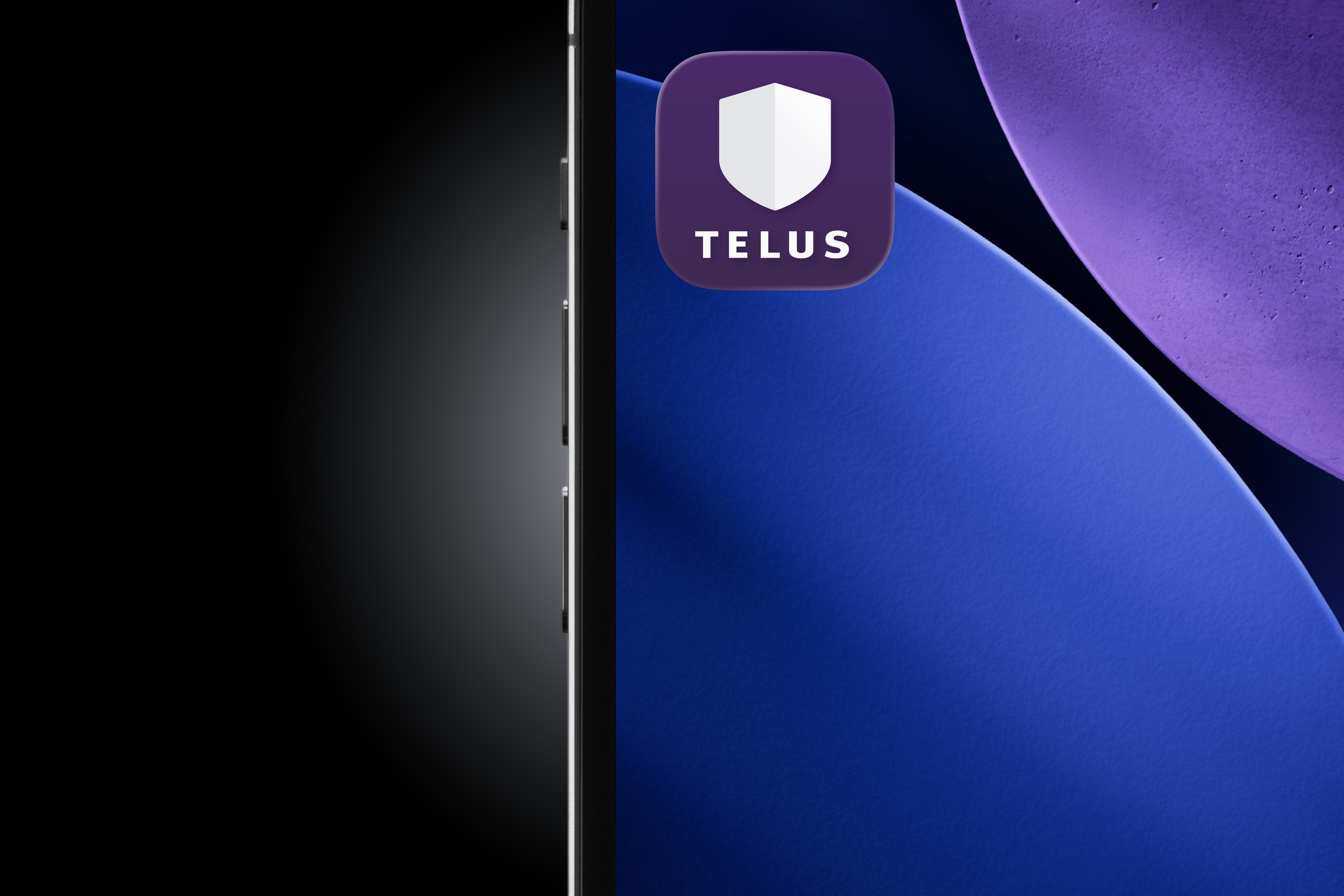
Designed for every display mode,
from light mode—
— to dark mode
The system adapts as the interface shifts.
One system,
multiple expressions
Each variation extends the TELUS brand while supporting different platform behaviours.


Ready for whatever comes next
The result is a scalable icon system that gives each TELUS product room to feel distinct, while staying recognizable across an evolving digital ecosystem.